New concept shows what Windows 10’s Resource Monitor could look like with a touch of Fluent Design

With built-in apps on Windows 10, such as Groove Music, receiving touches of Microsoft’s new Fluent Design language, one Redditor has decided to show a concept of what the Win32 Resource Monitor could look like if it got Microsoft’s makeover treatment.
Credit to Quayledant
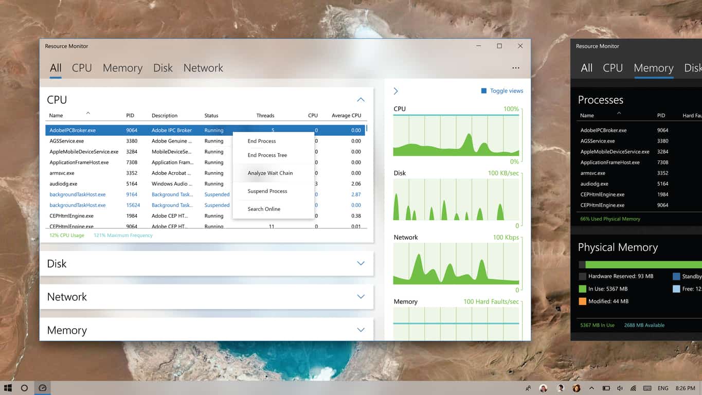
As you can see, the concept streamlines the Resource Monitor, such as making the CPU, Disk, Network and Memory graphs more visually appealing and noticeable without having to do any additional clicks, as well as turning the entire interface into a one-page system, where clicking the tabs opens the accordion that contains additional information of the selected item.
Those on Reddit appeared to like the concept, but cast doubt on the probability of Microsoft putting in the effort into making the Win32 programs pretty:
Would you like to see Resource Monitor receive the Fluent Design treatment in Windows 10?
Further reading: Fluent Design, Microsoft, Resource Monitor, Windows 10


Would you like this concept to become reality?