No, your eyes are not playing an April fool’s joke on you. Microsoft’s Bing now has a new logo that better brings it in line with the rest of the iconography across Office and Windows 10. Noted by Windows Central, the new logo is much more curvy and matches the Microsoft Fluent Design aesthetics.
\
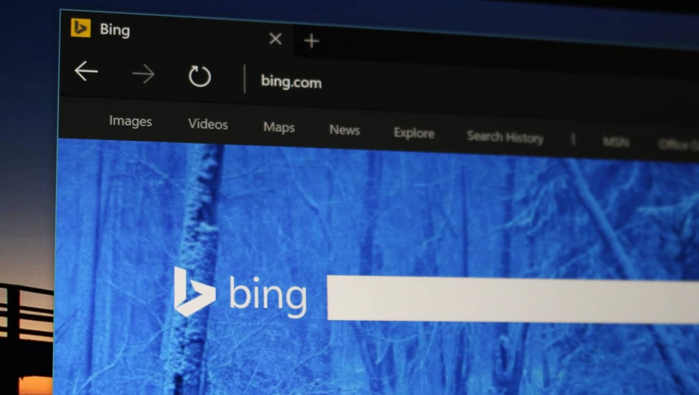
Although we’re not seeing this new logo on our end, both Windows Central’s Daniel Rubino and The Verge’s Tom Warren appear to have spotted this new Bing logo. Compared to the old one, it still keeps the lower case “B” but is now less pointed on the tips and a bit more circular. You can have a look for it at yourself in the image below.
\
Image via Windows Central
\
It’s great to see that Microsoft is going for some consistency across its products. The Office apps recently picked up new icons, and many of the Windows 10 icons are now getting updated too. Do you see this new Bing logo? Let us know what you think of it in the comments below.
\