Microsoft brings “glass” back to Windows 10 with “Project Neon” (video)
It seems Microsoft might finally be letting into the demands of Windows users with what is believed to be the operating systems biggest design refresh the launch of Windows 10.
This is Project Neon.
A little bit of history
Most people familiar with the history of UI design at Microsoft may recognize Aero. This is Microsoft’s last, and only attempt at baking translucency into their visuals. Widely appreciated by Windows users whose hardware supported it since the release of Vista 11 years ago, Aero has since faded into the design trends of the last decade.
While I agree strongly that these trends well deserved to die, many argue that translucency effects were wrongly tossed out with other outdated trends like skeuomorphism, the act of making things look like their real life counterparts. However, it’s been shown with things like Apples iOS 7, or MacOS Yosemite that it’s possible to blend frosted glass, into a more modern design language.
This is where the changes come in. Now widely dubbed ‘Project Neon’, this is Microsoft’s answer to the requests of Windows insiders about the lack of transparency in Windows 10. While it’s obvious that Windows 7 is of a dead design language, I have to admit that it was done rather well. It was consistent, it was balanced, and it was beautiful.
Microsoft’s windows are once again made of glass
In the last couple of updates for Windows 10, Microsoft has provided the tools to developers that allow them to use many of these transparency effects in their apps, though, it is only now that we’re starting to see them being used across the whole system in Microsoft’s own included apps.
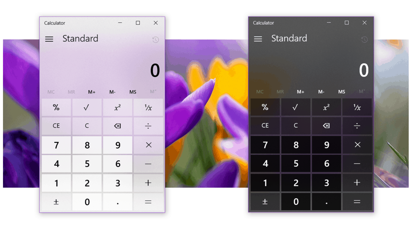
All of the different apps are using these effects a little differently, catering to each apps own layout. The effects are characterized by translucent regions that blur out whatever is behind them. They adapt to the light or dark themes and also have a subtle texture applied to them. These effects combine to highly resemble a matte polycarbonate acrylic or frosted glass.
In addition to the transparency, there are new hovering effects for items in lists, with a glow emanating from the mouse cursor very much like the hover effects seen in the old Windows 7 taskbar.
Acrylic? More like cheap plastic
I think that things look really rough. I don’t really care for the effects, nor do I think that they are done all that well. This is understandable though, as we’re seeing just the beginning of this process.
It’s just a little overdone right now. There’s transparency being flung around all over everything just because it can be; just take a look at what People looks like now. The effects remind me of what Control Center originally looked like when iOS 7 was first announced: overly transparent, thin lines, thin text, and just a blob of an ugly mess to look at and use. Fast forward to today, in iOS 10, the design looks much better thanks primarily to the restructuring of parts, and the reduction of transparency in the background.
I really hope things come together with this, and it’s not just the translucency. Extra modifications to the basic layout, spacing, and organization of elements will be necessary to accommodate for these effects.
We’ve seen many design concepts in the last few months for project neon, however, the ones that I appreciate the most are that ones that utilize these changes not just for the sake of having transparency, but to give the UI more structure. I particularly love the ones who capitalize on giving a more open layout, with more thoughtful spacing between elements, and adaptive margins. I want these changes to be handled in a way that makes Windows look cleaner, more organized, and more discoverable. Can they pull it off?
We’ll just have to see how these effects are finalized as development for this version of Windows 10 continues. Microsoft is expected to make an official announcement about these changes soon.
Further reading: Microsoft, Project Neon, Redstone 3, Windows 10


What do you think about translucency?