By now, some of you may have seen or read about the shots fired by Google’s vice president of design, Matias Duarte, towards Microsoft’s 10 operating system. Matias has been credited with the visual evolution the Android operating system and by extension, Google, has undergone in the last few years. With roots in the Palm webOS design team, Duarte was a much-needed design change for Google and Android.
Duarte took to his Twitter account to offer his colorful analysis of Microsoft’s most recent OS update, Windows 10.
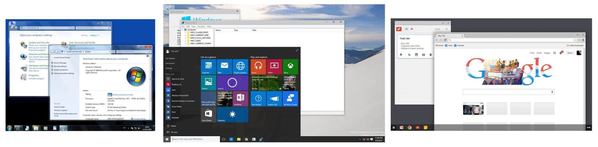
I just setup a Surface 4 & Windows 10 – not sure why I was excited to try a new thing, it’s basically XP with a flat design skin. #FutureNot
— Matías Duarte (@MatiasDuarte) November 2, 2015
With a series of tweets, Duarte explains that he recently set up Windows 10 on a Surface 4 (assuming Surface Pro 4), and to his dismay, it looked like Windows XP but with a ‘flat design skin.’ Admittedly, Windows 10 is still a hodgepodge of decades old design languages that surface in various crevasse throughout the OS. Our own Brad Stephenson speaks to the matter in a separate post, where he mentions that Windows legacy support virtually trapped its efforts with design.
“To entice all of these users to switch over to Windows 10, Microsoft had to slow down and redesign Windows to visually resemble older operating systems despite all of the technical improvements and innovations. The tiles’ importance was reduced significantly, and the Start Menu was brought back and even became one of the main selling points in the marketing leading up to the launch of Windows 10.”
Arguably, Brad aligns himself with Duarte by extension of his reasoning, but not for the same criticism Duarte is laying at the doorstep of the Windows team.
“You should upgrade to Windows 10. It’s just like XP and Windows 7”, “No, don’t worry about the tiles, they brought the Start Menu back. It’s just like the old Windows you’re used to”, “It’s a really good upgrade that has heaps of new features but pretty much functions like the old system used to.”
While Brad, in a roundabout way agrees with Duarte, the nuances of their observations are vast. Brad, arguably, comes off as a well-versed Windows user taking thoughtful consideration into account. On the other hand, Duarte seems to be trolling the Windows team and fans of Windows 10 by extension. [pullquote align=”right” cite=”” link=”” color=”” class=”” size=””]”Microsoft had to slow down and redesign Windows to visually resemble older operating systems despite all of the technical improvements and innovations.”[/pullquote] Perhaps, what has many Windows 10 defenders in a tizzy is that Duarte’s comments seemingly come from a place of convenience in regards to Android and Google while also being hypocritical. Android benefits from relatively short lifespan and OEM’s skins being the predominate Android interface most users interact. Furthermore, Google properties are arguably seen as a collection of apps rather than a cohesive operating system in comparison to Windows. With TouchWiz and HTC Sense being the predominate “Android interfaces,” they have allowed Duarte and co, to experiment wildly with design in Android’s short lifespan without public scrutiny with its modest Nexus program. What makes Duarte’s comments odd and hypocritical to many is the fact that even when he’s not talking about design but rather how something works, he’s ignoring the familiarity that accompanies both Android and Google while belittling the engineering behind Windows 10.
I have no beef with how #Windows10 *looks*. I’m disappointed it *works* just like XP.
I understand that’s a feature for many. Not for me!— Matías Duarte (@MatiasDuarte) November 2, 2015
Mentioning how sad he would be if Android operated the same way ten years from now, seemingly turning a blind eye to how Android has worked for the last eight years. As nice as Material design is and as cohesive as some users find it, smartphones and even desktops operating systems are no more than app and program launchers. Sure Android and Google with Material design have a few more bells and whistles, but those bells and whistles are a means to an end, not a destination. The same applies to Windows 10, iOS, and OSX. On Windows, icons may be from different generations, but as long as they are in the same place and do the same thing they’ve always done, people seem to appreciate that. The Windows team is attempting to engineer one OS platform that works the way people will expect it to, across various devices, while keeping design familiar and mature enough for old and new users.
Durate, his design team, and OEM partners appear to be well aware of familiarity to some extent, keeping the hollowed Google Search bar at the top of the screen on Android home screens for the last few years. Furthermore, the taskbar/start menu paradigm was seemingly co-opted to help Windows and OSX (to a lesser extent) users transition over to a somewhat ‘familar’ ChromeOS.
In light of these observations, Duarte’s comments come off as nothing more than, an admittedly, successful troll of the Windows team and its users rather than legitimate concerns from a fan of design. His comments seem to want to invoke change for change sake despite the very public disapproval of previous attempts or the well-established paradigms of desktop computing. As Google gets ready to merge a version of its Chrome OS and Android, Duarte’s comments should put him and his team in the crosshairs of industry observers. It will be interesting to see how he and his team revolutionize filesystems, and copy/paste that don’t harken back to Windows XP style of operating.
Further reading: Google, Material Design, Windows 10