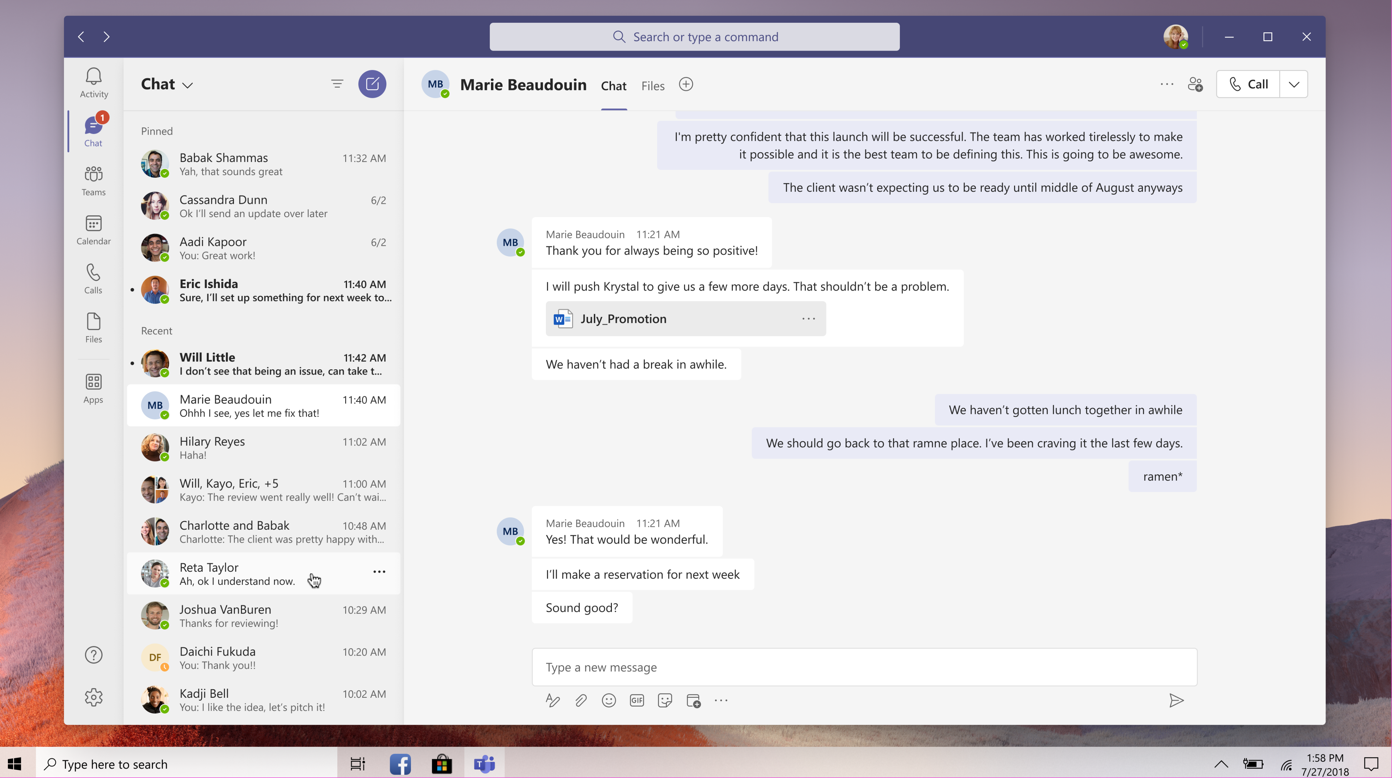
Back in October, Microsoft detailed a new Theme and Fluent icon update that would soon make its debut on the Teams collaboration platform. Microsoft Teams users have been waiting for these changes for quite some time now, and this new experience is now available for testers with the newly-released update for the public preview program.
Teams dark theme juste became WAY darker. #Windowsinsiders pic.twitter.com/OLGAPHfn2Q
— Florian B (@flobo09) January 15, 2021
If you are enrolled in the Microsoft Teams public preview program, you’ll notice that the company has updated the default and dark themes in Teams with new background colors and introduced subtle design changes. As seen in the screenshot above, Microsoft Teams has finally picked up an improved dark mode experience, with the UI elements appearing a bit more on the darker side.
The default theme is also getting similar treatment, and a shade of white has replaced the bright purple color in the app bar. The other noticeable changes in this update are the new drop shadow effect that has been applied between panels and the new rounded corners for various UI elements.
Overall, this is a nice coat of paint and a seamless transition to keep the UI of Teams consistent with the overall Microsoft 365 design vision, which was revealed in July 2020. Keep in mind that this release doesn’t include the Fluent icon update, and the company plans to ship it to testers in mid-February. Have you spotted these changes on your PCs? Let us know in the comments down below.


