
At Ignite 2017, Microsoft hinted at upcoming changes for OneDrive, including a new cleaner UI, and universal platform sharing. Today, the company shared some more details about the forthcoming changes, calling it “beautifully useful” and detailing that it will be rolling out to everyone in the coming weeks.
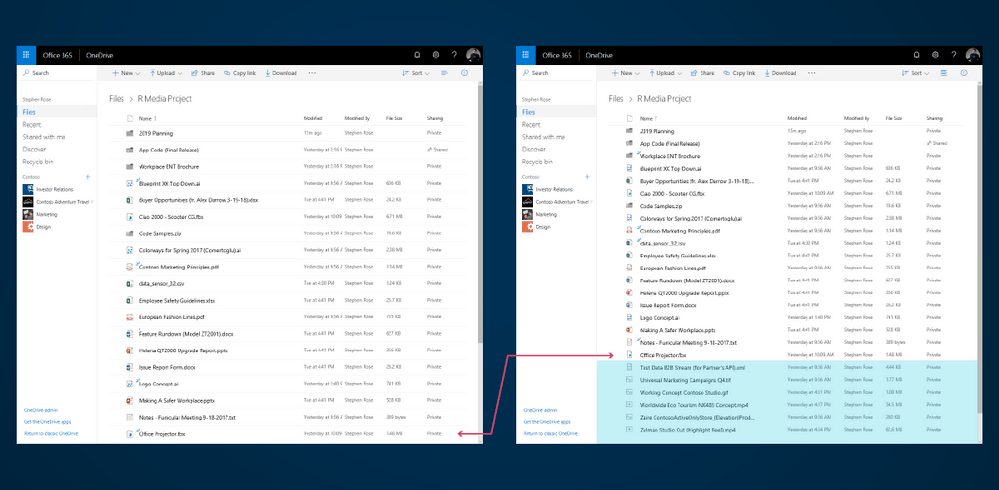
We begin by highlighting what Microsoft is calling “Refreshed Design.” Seen in the featured image above, with the new OneDrive Web experience, screen space is used more efficiently and there is a more cohesive theme across apps and devices (on iOS, Android, Web, Windows 10 UWP.) Users will also be able to scan file names and pick out essential information at a quick glance. The experience was built on the feedback of those who actively use OneDrive, and here is a bit more on what is expected:
New files jump out at you. Shared files are now easier to spot and we have made the thumbnails larger and more detailed. Your eyes are attuned to recognize familiar shapes and colors instantly, our design helps you quickly find the items you’re working on via improved list and tile views with clearly defined shapes for files and folders.
It’s also worth mentioning that OneDrive on the Web will pick up new list flexibility and compact mode options. The new options will make the web experience look similar to the File Explorer in Windows 10, since users will be able to adjust column widths and flex data to their working styles:
One of the frequent asks from some of our power users was a “high density list view” that resembles the files explorer. Today we’re announcing a new Compact List that packs more items into folder views across OneDrive and document libraries with an even more uncluttered layout so you can handle thousands of items with ease.
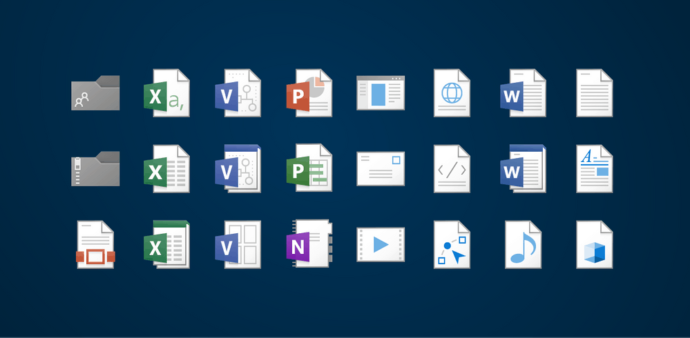
Next up, Microsoft is updating the preview generation image on OneDrive for the web, meaning that users will see “crisp thumbnails and large previews with incredible speed” for over 270 different file types. Lining up with this, the company also reworked file icons, making them more modern and lightweight, while still keeping them recognizable:
Our preview-generation engine creates crisp thumbnails and large previews with incredible speed, and they look especially gorgeous on 4K and Hi-DPI displays like the Microsoft Surface Pro. All these previews will make you more productive and find your files faster when you’re using OneDrive…
To support changing trends and the latest apps you use, we’ve also completely re-worked our file icons to be modern and lightweight while keeping them familiar and recognizable. We’ve generated over 4200 variations and sizes of icons to ensure your files are crisp across all your devices.
Other changes detailed today include smarter connections, the ability to stay informed on what’s popular, quickly locating new files and more. You can read up on these changes below:
- Popular files show a trending indicator, so you no longer have to dig around to see what’s hot and where you’re influential.
- Quickly find that colleague’s contributions with our “New Item Indicator”, which is a small gleen that looks like eyelashes above files and folders.
- The file card is a new way to peek into who has viewed your file and when. This is a capability you won’t find anywhere else, which coupled with our instant previewers and deep version history for all file types lets you know more about what’s happening with your files
- The updated Recent View experience across OneDrive, Office.com and the Office apps increases the accuracy and capabilities of the Recent view and ensure the content is consistent, familiar, and easy to find
Again, Microsoft is saying that these features will be rolling out in the “coming weeks” to Windows, Web, iOS, and Android, so it’s best to stay patient. For now, though, let us know your impressions in the comments section below.