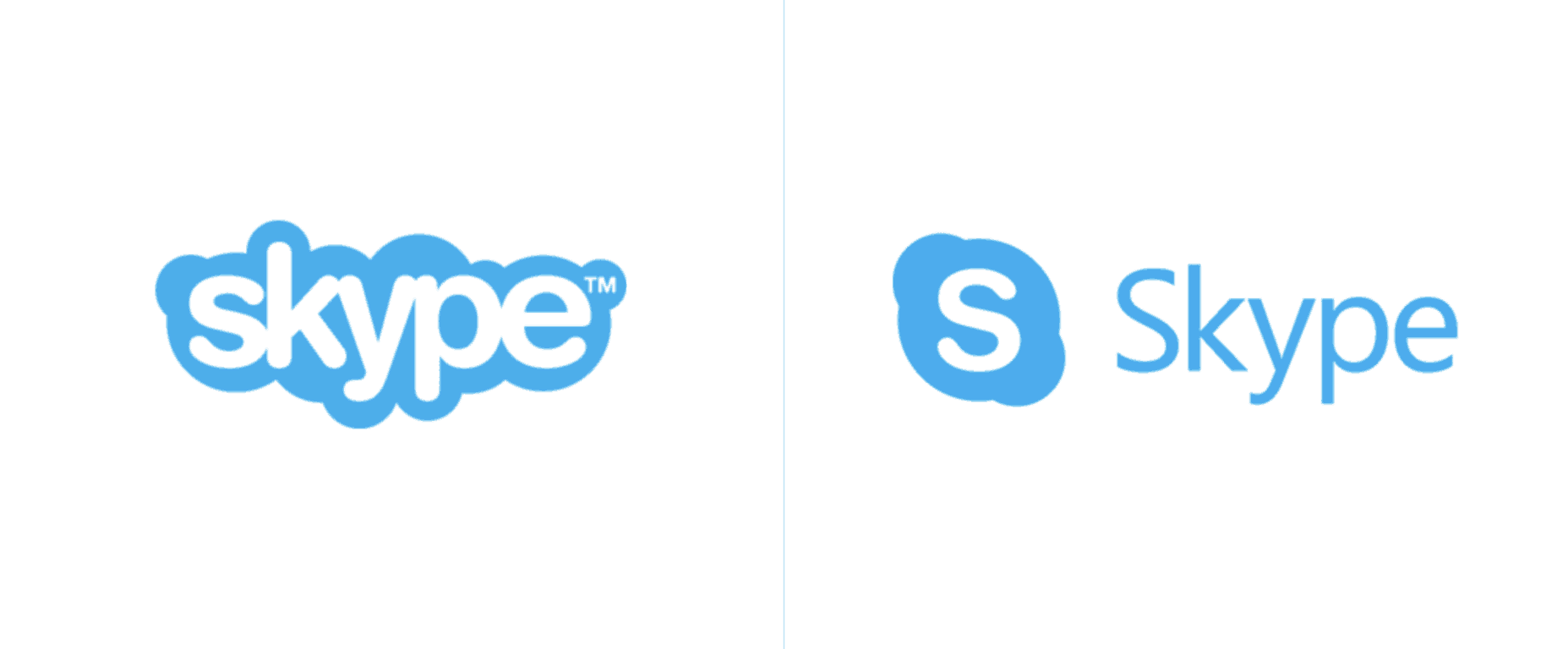
Earlier this month, Microsoft unveiled a redesigned version of its Skype messaging app, which looks much more familiar to popular mobile messaging apps such as WhatsApp, Facebook Messenger or Snapchat. The app is now available in preview on iOS and Android and is expected to roll out to Windows and macOS later this year, but it looks like Microsoft used this upcoming redesign to quietly introduce a brand new Skype logo (via The Verge).
The updated logo was discovered yesterday by Brand New, but as of today it seems that the new brand identity only appears on the Skype blog or this page dedicated to the redesigned app. This isn’t really a dramatic change as the white S logo in the blue bubble is still around. However, Microsoft has dropped the “full” Skype logo with the blue cloudy outline: the new logo now uses Microsoft’s corporate typeface, which looks more serious and consistent with other Microsoft products.

We think some users will probably prefer the old logo, but as Brand New put it this “clearly signals Skype isn’t the cute Danish start-up it once was.” Let us know your thoughts about the new logo in the comments.


