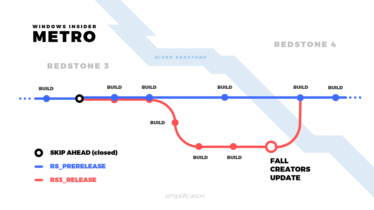
As we’re approaching the release of the Fall Creators Update, Windows Insiders on the Fast ring are moved off of the RS_PRERELEASE branch to RS3_RELEASE. ‘Skip Ahead’ was an option provided to Windows insiders who wanted to skip RS3_RELEASE, and continue on the RS_PRERELEASE branch to Redstone 4. At this point, however, Windows Insiders will mostly just see bug fixes.
We are now at the point of the development cycle for the Windows 10 Fall Creators Update where our focus is now on stabilization for release to the world.
Our engineering teams remain focused on getting the Windows 10 Fall Creators Update ready for release. This remains our priority.
-Dona Sarkar, Windows Blogs
Now that we’re at this point, Skip Ahead is now full and closed. After the release of the Fall Creators Update everyone on the Fast ring will be lumped back together on RS_PRERELEASE for Redstone 4.
My People
The beloved My People feature is tidying up in preparation for the big update this fall, as Microsoft is asking Windows Insiders to dabble around with emoji. When a contact on your taskbar sends you an emoji in Skype, it’ll pop out of the taskbar big, bold, and animated as you would expect from Skype emoji.
OpenType Variable Fonts
Anyone who has used Microsoft Word knows what a font is. Exploring the list of fonts included with Windows, you may have noticed some fonts have several listings under different names such as ‘Segoe UI light’ ‘Segoe UI regular’ or ‘Segoe UI black’. These fonts are part of what’s known as a family; a group of a typeface adjusted to several different weights or styles. Normally, you might find that a font family is spread out across multiple files, and has a small handful of different weights to choose from.

Bahnschrift is the first OpenType Variable Font to be included with Windows. The variable font technology behind Bahnshcrift allows a family of typefaces to be condensed into a single font, whose weight can be adjusted dynamically and precisely. Imagine being able to simply drag a slider to choose the weight of a font! This technology opens new doors to designers and developers, where creative expression and adaptive UI will benefit most.
Fluent Design
The Windows UI could certainly benefit from more consistency. Unfortunately, though, the Fall Creators Update will get just the opposite of that. The excuse is that Fluent Design is coming out in waves, however, this doesn’t help the fact that it’s being used in such an inconsistent manner across Windows. It’s like a partial remodel to a different architectural era; a jungle of different styles. It’s not just unsightly, it can be confusing. Nevertheless, countless bugs are being dealt with so we know it’s going somewhere.