Do you like this Xbox One dashboard redesign?
![]() 1 min. read
1 min. read
![]() Published on
Published on
Share this article

Read our disclosure page to find out how can you help Windows Report sustain the editorial team Read more
Microsoft completely revamped the Xbox One UI this week and the reaction to it from users has been pretty mixed with many expressing their dislike of the overall design aesthetic, the font used, the removal of more Kinect functionality, the strange hiding of key features such as the Friends list, and the amount of unused space on the dashboard.
Reddit user, AdamEthan94, today posted his own vision of what he would like to see the Xbox One dashboard look like and it’s actually pretty nice. The identical size of the main bar graphics are much more pleasing to the eye than the one big icon on the left of the screen that’s currently in use. The small widgets have also been replaced with the more-functional pins and a proper Friends list that shows the full name of the contacts and what games they’re playing.
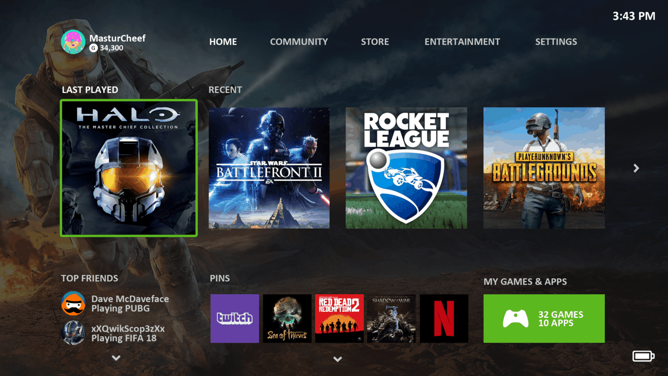
Do you like this mock-up? What else would you change on the Xbox One dashboard? Let us know in the comments below.