For many years, Apple has often been lauded and criticized for its ability to steal ideas from its competitors. We’ve seen this with the graphical user interface back in the 80’s, or more recently with FaceID on the iPhone X. One thing is sure though, the Cupertino giant often proved that it can better execute on brilliant ideas that its competitors first came up with.
The last example is probably the new dark theme in macOS Mojave, which is now generally available for Mac users. As you may know, the dark theme option was one of the main features of Windows Phone 7, especially when coupled with AMOLED screens. Well, such screens are still a rarity in the PC world, but Windows 10 had a dark theme option from the beginning.
I’ve found that when you try the dark theme on Windows 10, it’s pretty hard to go back. Dark colours are definitely much easier on the eyes, especially during nighttime, and it’s really a refreshing change after so many years of UI stagnation on Windows. Well, after checking out the new dark theme on macOS Mojave, I’m afraid I can’t deny that it looks much more polished than the one in Windows 10.
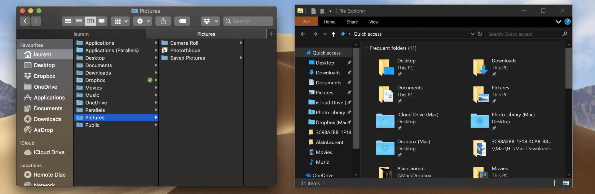
Unlike Microsoft, which still uses a deep black colour in some places, Apple uses different shades of dark grey. I’ve taken a couple of screenshots to compare Windows and Mac apps side by side, and you can see below the macOS Finder next to the Windows 10 File Explorer. MacOS also had its “Fluent Design” update years ago, and the various transparency effects are really subtle.
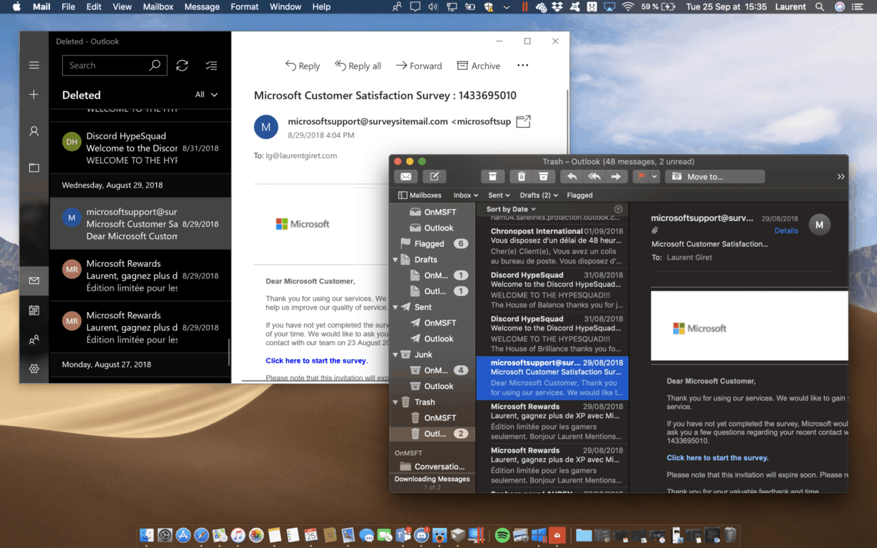
Next, I’ll add a comparison of two core productivity apps, Outlook Mail and Apple Mail. The latter comes with a dark background for the reading pane, which I think is much better. While this not related to dark theme, information density is also much better on Apple Mail, and the giant buttons in Outlook Mail can’t hide that this an app optimized for phones and tablets.
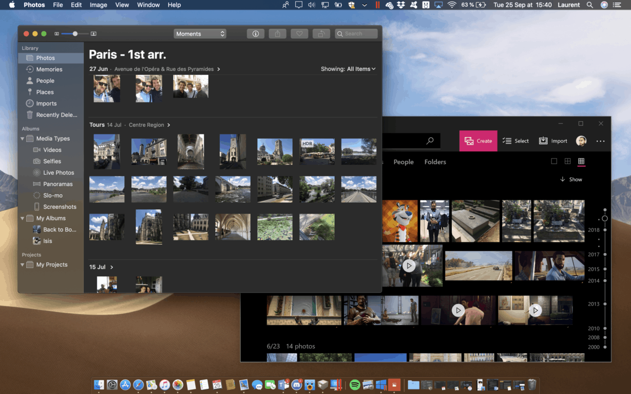
Lastly, a quick look at Apple Photos and the Windows 10 Photos app. Again, Apple uses different shades of dark grey while the Windows 10 Photos app still uses a deep black colour. Again, Apple’s Photos app comes with sole light transparency effects on the left panel, which is a familiar design across Mac apps.
 To be fair, Dark Theme on Windows 10 has been a work in progress since the beginning, and because all stock Windows 10 apps are now updated through the Store, Microsoft is free to try different design changes without having to update the full OS. However, this is a different story for other components like the Windows Shell, or legacy apps like File Explorer.
Beauty is in the eye of the beholder, as the adage says, but I’m really impressed by Apple’s ability to get dark theme right and consistent on the first try. The company had plenty of design missteps over the years, especially when Apple designers were still obsessed by skeuomorphism, but I now find it difficult to appreciate the dark theme on Windows 10. What has been seen cannot be unseen, and I now hope that Microsoft designers will take a deep look at macOS Mojave. Windows 10 is far from looking bad, but there’s still definitely some room for improvement.
Further reading: dark theme, macOS, Windows 10