Windows 10 People app gets a new Fluent Design icon
![]() 1 min. read
1 min. read
![]() Published on
Published on
Share this article

Read our disclosure page to find out how can you help Windows Report sustain the editorial team Read more
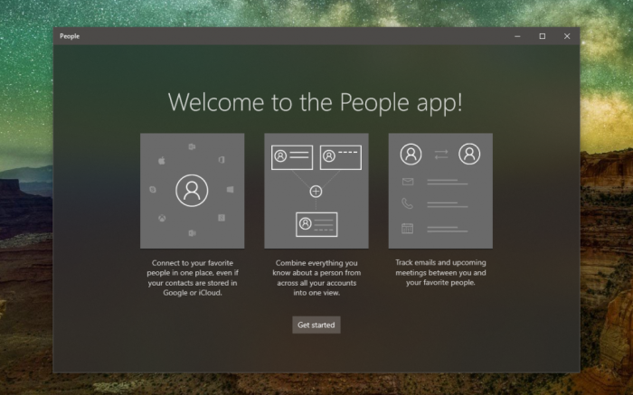
Microsoft has started rolling out a new icon for its People app on Windows 10. The new icon inspired by Fluent Design previously shipped to Windows Insiders, as did other new icons from Microsoft’s inbox apps such as Photos, Weather, Alarms & Clock and Mail and Calendar.
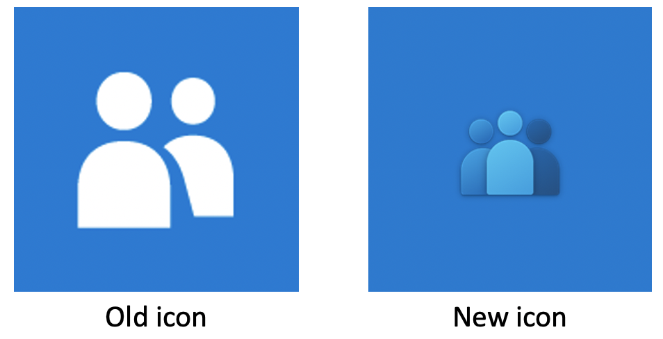
You can see the old and new People app icons side by side below. Just like other app icons refreshed recently, the new People app icon uses a blue background color by default, and it doesn’t respect your choice of accent color in the Windows 10 Settings app.
.
Microsoft isn’t done yet refreshing all of its app icons on Windows 10, and icons for Calculator, Camera, Feedback Hub, Maps, Messaging, and even the Microsoft Store will likely get a fresh coat of paint sooner or later. Do you like this new icon for the People, or did you prefer the old one? Sound off in the comments below.