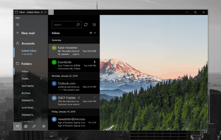
Microsoft appears to be slowly tweaking its dark mode on Windows 10 to make it look slightly less dark. We first saw this change with the Microsoft Store app, which now uses a dark grey background colour, and the dark File Explorer that Microsoft introduced in the October 2018 update also uses different shades of dark grey.
The next Windows 10 apps that will abandon the completely dark background colour appear to be the Outlook Mail and Calendar apps. As spotted by Spanish blog Microsofters, Microsoft has started testing the updated dark mode with select Insiders, and you can see how it looks below:
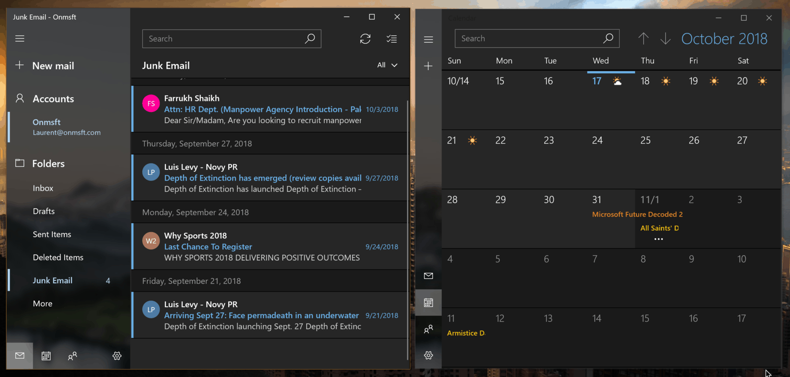
This is a subtle change, and it’s certainly not shocking if you’re used to seeing this dark grey color in the Microsoft Store or other places like Outlook.com or Microsoft To-do. Many stock Windows 10 apps still use a deep black background color such as People, Groove Music or Alarms and Clocks, and it’s possible that all these UWP apps will receive a similar fresh coat of paint in the near future.
This lighter dark theme also seems to be more in line with the dark mode in the Xbox One OS, as well as what Apple has done with its own dark mode for macOS mojave. Do you prefer this new dark grey background color, or do you think the deep black that Windows 10 still uses in many places look better? Sound off in the comments below.