As Microsoft Teams becomes more popular, it’s putting up quite a battle against its rival Slack. We’ve already seen this play out outside of the office in TV commercials, but Slack might have just taken things to a new level. Early Wednesday morning, Slack revealed a major redesign that gives its collaboration hub a brand new look, and some of it might feel familiar to Microsoft Teams users.
At its core, Slack’s redesign is centered around the areas that we last said were slightly better than Microsoft Teams. This includes the navigation bar, ways to find conversations, files, apps, starting messages, organizing channels, and shortcuts. A summary of the new features can be seen below. Slack also says the rollout of this new look starts today and will continue over the next several weeks.
- Navigate channels and search across your organization with a new navigation bar
- Discover key conversations, files, apps and more—all at the top of your sidebar
- Start a message from anywhere with a handy new compose button
- Organize channels, messages and apps into custom, collapsible sections (you know, like folders)
- Take swift action with your apps through shortcuts.
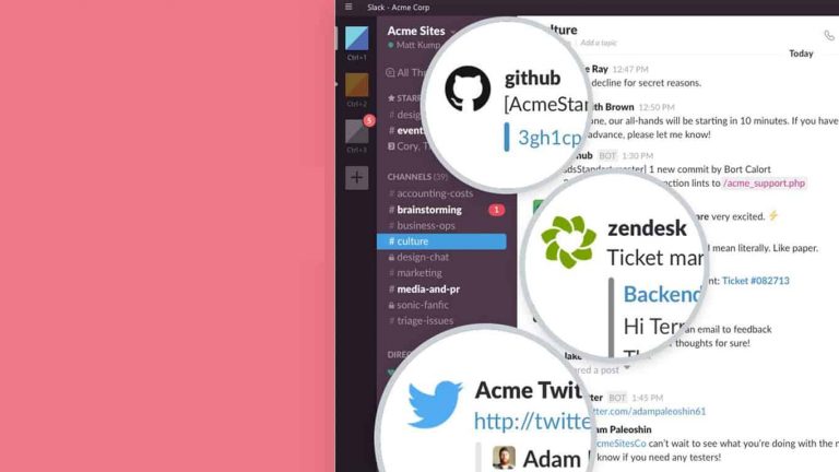
Slack’s newest feature in the redesign is the navigation bar. In the incoming update, the search bar atop Slack gets bigger in size and will give users access to finding conversations, and much more. Slack also says other information is also stored neatly atop the sidebar, such as mentions, reactions to your messages, files, people and apps. That is similar to the search bar in Teams, which can be used to find messages, and start certain commands.

Second is the all-new compose button. This makes it easier to craft messages. However, it is different from Teams in that users will be able to save draft messages when using the button. “It’s a convenient way to begin drafting a message, before deciding the person or channel you’ll send it to,” explained the Slack team.
Moving on, with Slack’s shortcuts, users will be able to click a new lighting bolt icon and work with an app, without having to switch between multiple windows and tabs. Apps confirmed to work with this at launch include Simple Poll, Cisco WebEx Meetings, and Freshdesk. Slack promises that “many more app shortcuts are still to come.” This would be similar to Microsoft Teams, where apps can run in “tabs” within a channel or conversation.
The area where Slack’s clean new look wins the most, though, is where Teams currently lacks. Slack users on paid plans will be able to organize their channels, direct messages, and apps into customizable sections in the sidebar. This includes dragging channels around like folders and ordering them. Currently, you can do this in Teams by dragging around individual Teams, but not with sub-channels.
Slack dives deeper into the reasons for its design changes in a separate blog post. It claims that the changes help create “a simpler and more organized Slack.” Do you like these changes in Slack, or do you prefer Teams? Let us know in the comments below.