
When the Windows team made the transition from Windows 7 to 8, it bet heavily (arguably too much at the time) on typography and iconography in ushering in a new era of quick visual identification and representation for more dense information.
While the Windows team may have backtracked on its more aggressive design vision of Windows 8, the styling cues of its Metro/Modern Design are still very much alive in Windows 10 and the team would like to help developers to make full use of them when engaging users.
In a blog post titled Using iconography to enhance UX design, the Windows team walks developers through the nuances of leveraging icons, specifically how and when to replace text or copy within apps and services with images.
Iconography is a visual language used to represent features, functionality, or content. Icons are meant to be simple, visual elements that are recognized and understood immediately.
It perhaps goes without saying that, thanks in large part to the limited surface area and input methods beholden to smartphones and tablets, developers have had to exercise more creative methods for displaying information and menu options. The Windows team’s iconography tips include:
When to use custom iconography
Standard icon sets only go so far, however. In addition to OS or device-specific icons, your app may also need its own set of icons to represent app-specific functionality that the standard sets cannot accommodate without creating ambiguity for the user (e.g. recipe search, movie bookmark, image download).
This goes beyond the user simply not knowing what to do. If the user is likely to hesitate or expend any energy in order to figure out an icon in your app, then you will probably want to use a custom icon.
Where to find icons
Like fonts, icons are available for download. Icon sets are designed by professional artists and made available for you to use in your app. You may choose icons sets that are free (like vectoricons.org and freeiconsdownload.com) or icons that can be purchased (such as those on popular sites like istockphoto.com, shutterstock.com, and iconshock.com).
And perhaps most important, the team stresses being consistent. The last note the Windows team offers may go without saying, but a consistent typography and iconography where applied, goes a long way in helping users quickly develop muscle memory when navigating an app or service.
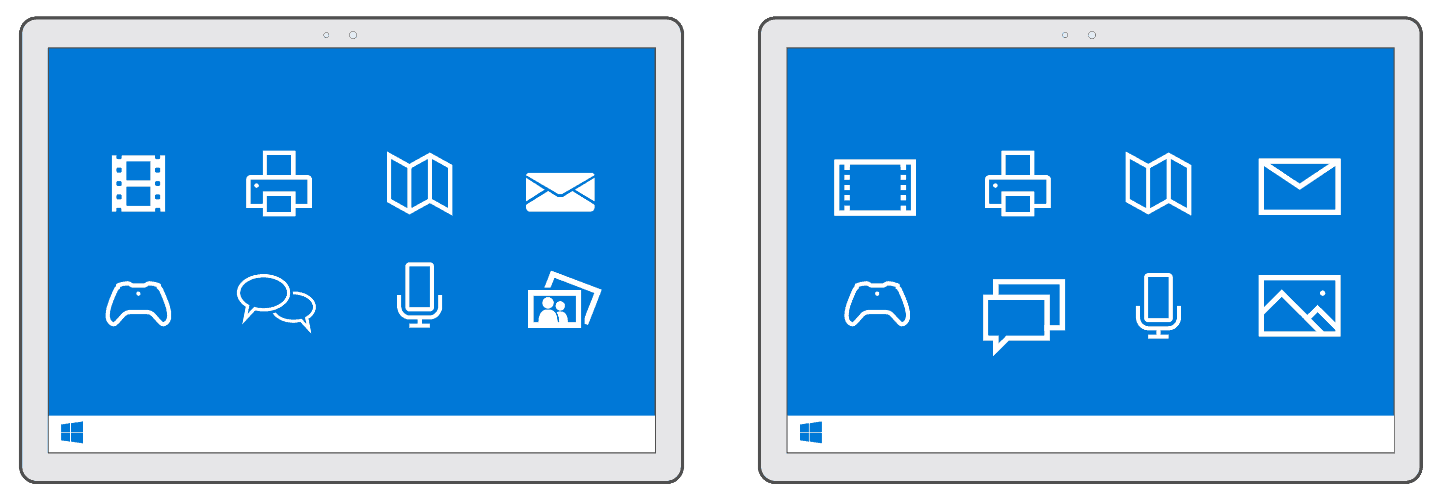
Likewise, consistency ensures that each icon has equal weight, drawing your users’ eyes equally. Take a look at Figure 3 below. Both the left and right images may look similar, but notice how the icon style on the left has both filled and unfilled shapes. This inconsistency pulls the eye of the user disproportionately to the filled icons—video, mail, and photo. In contrast, check out the icon set on the right. Those icons are consistent in both their thematic style and design elements. Each one engages the eye equally.
There are a few more details regarding iconography that are recommended, and developers can follow up on them in the Building Apps for Windows iconography series. As Microsoft continues to court developers to its development tools and environments, the company is also benefiting from an industry that is also looking to leverage similar app design languages across platforms and services. No longer is larger typography and iconography-heavy navigations seen as an albatross of software design.