Microsoft reveals new company logo after 25 years
![]() 1 min. read
1 min. read
![]() Published on
Published on
Share this article

Read our disclosure page to find out how can you help Windows Report sustain the editorial team Read more
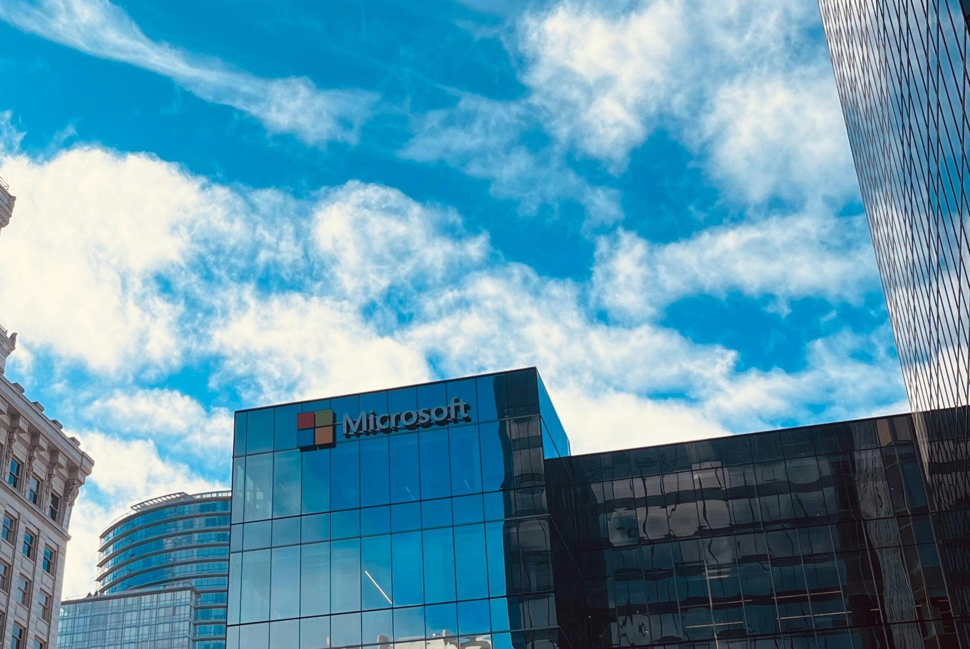
Microsoft has just revealed a new company logo, after 25 years. This new logo appears to have a common look and feel across other products such as Windows 8, Windows Phone 8, and Xbox. Microsoft wants this new logo to “visually accentuate” a new beginning.

“It’s been 25 years since we’ve updated the Microsoft logo and now is the perfect time for a change. That’s why the new Microsoft logo takes its inspiration from our product design principles while drawing upon the heritage of our brand values, fonts and colors,” Microsoft stated in an official blog post. The new logo uses the Segoe font and the symbol features squares of color that express the company’s diverse portfolio of products. Expect to see this new logo on Microsoft.com, as well as on TV ads and Microsoft retail stores soon.