How to Create a Unified Inbox View in Outlook
Using the Search bar is the easiest way
![]() 6 min. read
6 min. read
![]() Updated on
Updated on
Share this article

Improve this guide
Read our disclosure page to find out how can you help Windows Report sustain the editorial team Read more
Key notes
- Unified inbox view helps you check your email messages from different accounts at once.
- You can create the inbox view using the Search bar, creating a rule, or using macros on VBA.
- Find the quick steps for each of the methods down below.
If you have multiple email accounts configured in your Outlook, each would have a separate Inbox. You need to juggle between the inboxes to keep a check on the incoming emails and stay updated with the communication.
To reduce the hassle, you can create a unified inbox in Outlook to combine all inboxes from different email clients.
In this guide, we will discuss methods with step-by-step instructions to merge Outlook accounts to streamline communication.
What is a unified inbox in Outlook?
A unified inbox in Outlook is a common inbox with all of your email accounts, where you’ll receive messages from all of your email addresses. The benefits of having one are:
- Saves you time – Allows you to check all the emails in one place so you don’t miss anything important, saving your time and effort.
- Helps you prioritize – With a unified view, you can check all emails, decide the priority and respond to them accordingly.
- Enhance cross-account visibility – Helps you get all important communications immediately if you have different projects and responsibilities.
- Focus on the content – A unified inbox helps reduces the cognitive load of managing multiple accounts and enables you to focus on the emails’ content.
- Organized inbox – Being able to check all the email messages in a single view helps you sort and categorize them in a better way.
In Outlook 2016 and later versions, there’s also a similar feature called Focused Inbox, but it works for one email address at a time. Here’s how to enable or disable it.
How can I create a unified inbox view in Outlook?
If you are looking for ways to combine inboxes in Outlook, know that there is no straightforward way to do it, but there are various workarounds to get the Outlook combined inbox view for better email management.
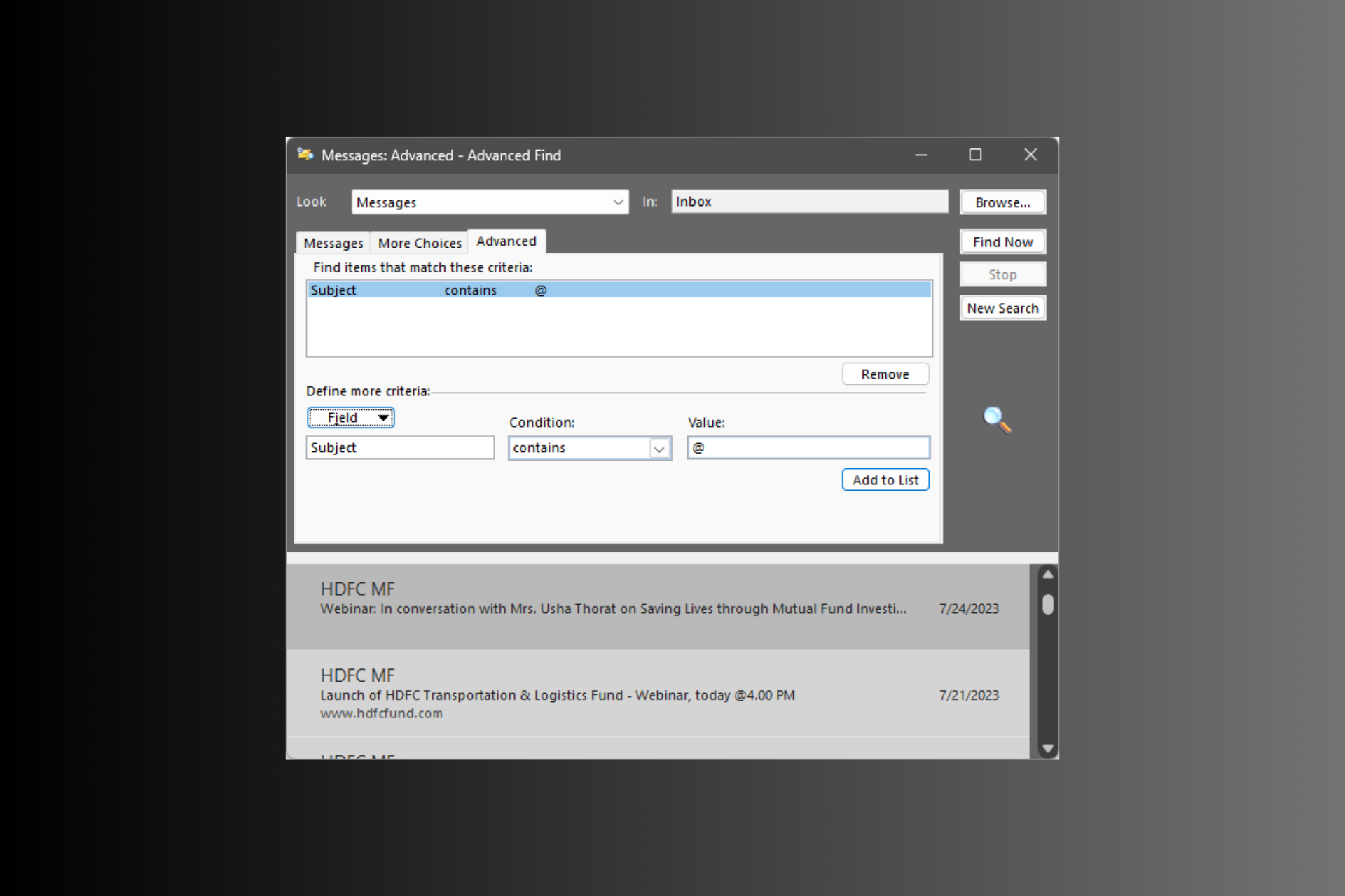
1. Use the Search bar
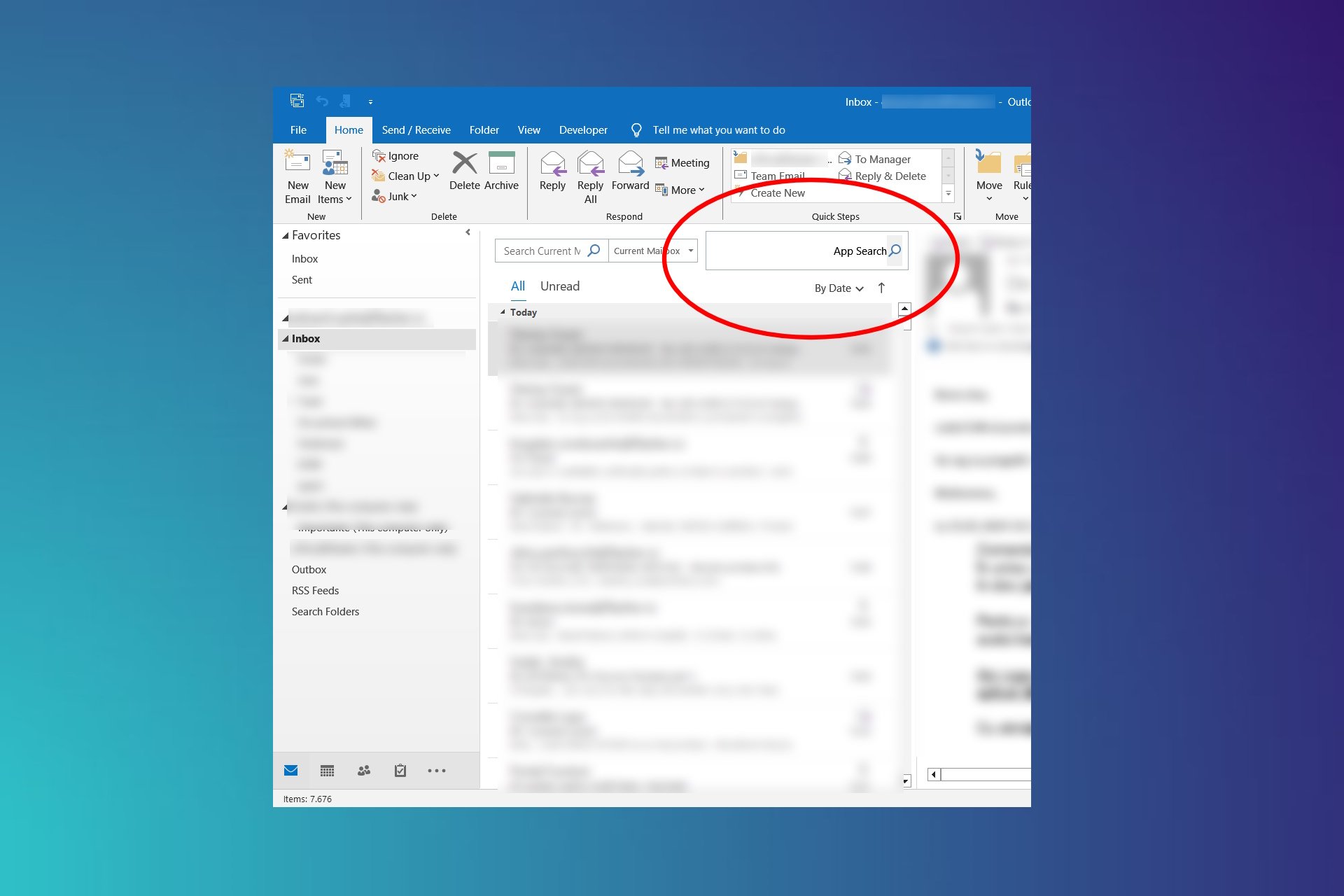
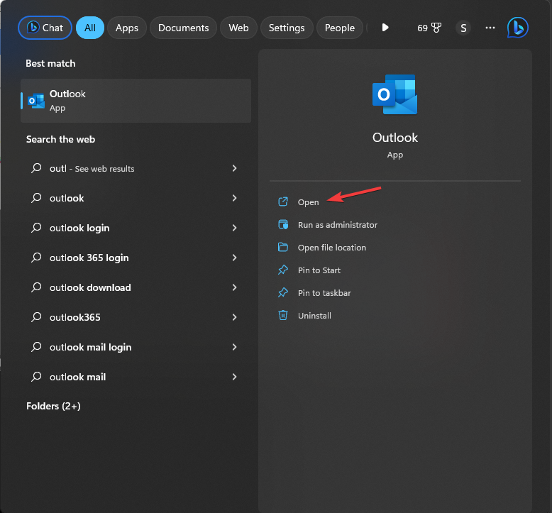
- Press the Windows key, type outlook, and click Open.

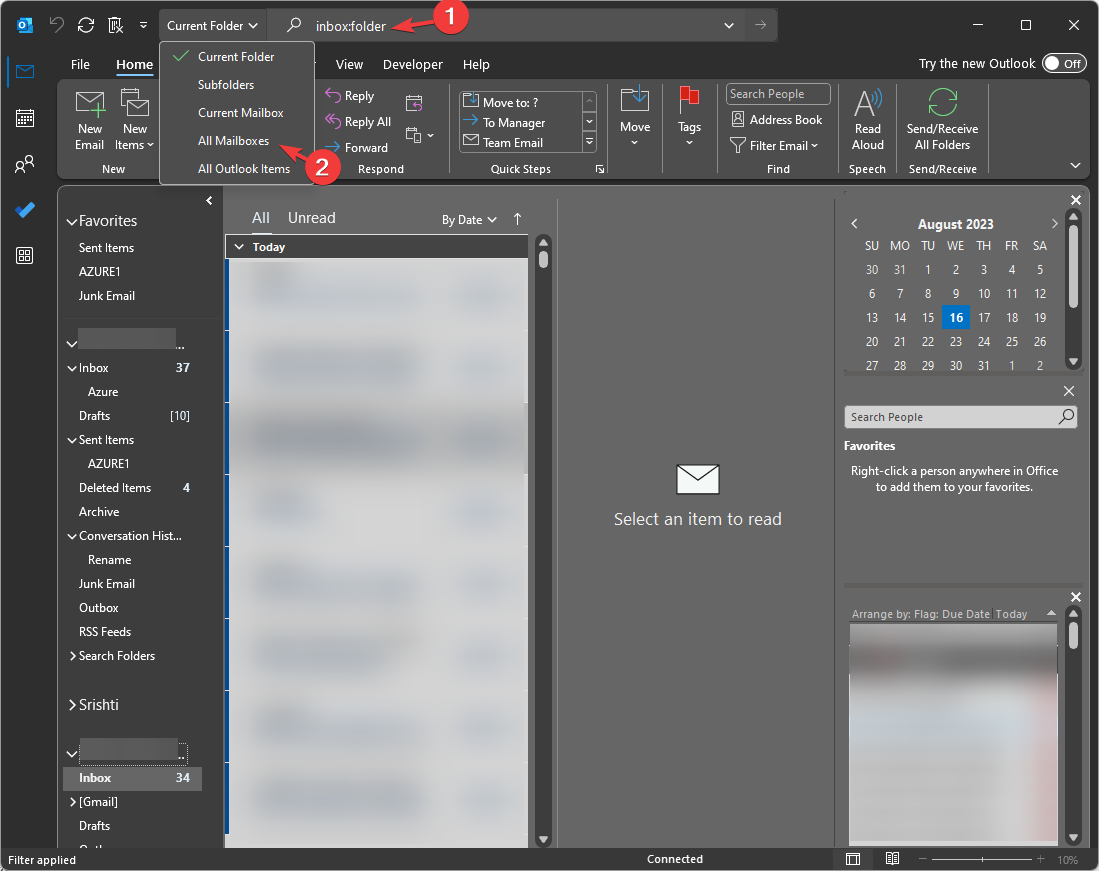
- On the Outlook main window, select any of the inboxes. Go to the Search bar, and type folder: Inbox.
- Click the downward arrow at the left, and change the Current folder option to All Mailboxes. This will show you the emails from all the email accounts at once.

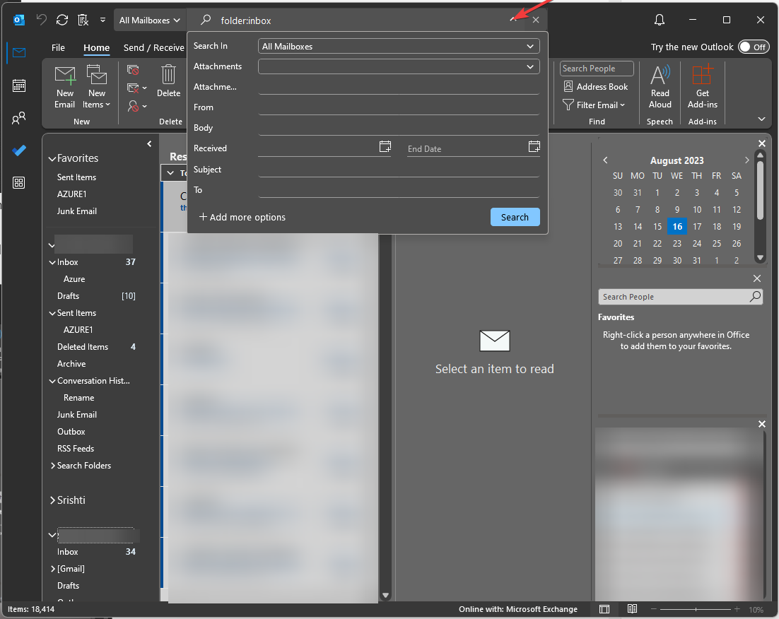
- Click the downward arrow to the right of the search bar and filter the list further by selecting fields like Date, Subject, Size, etc.

Once you have input a search query, you can access it in the future by clicking the Search bar, and choosing the Recent Searches option, thereby merging your inboxes on Outlook whenever you want.
Sometimes when you change settings or adjust filters, if you notice some emails have disappeared from the results, to fix that, you should try to adjust the filters or check your account settings.
2. Create a rule
First, you will have to create a folder. Here’s how to do that:
- Press the Windows key, type outlook, and click Open.
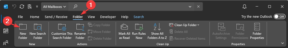
- Go to the Folder tab, and click New Folder.

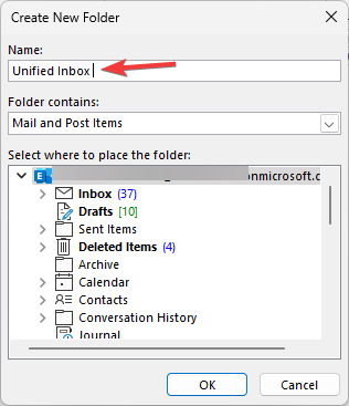
- Once the New Folder window appears, name it Unified Inbox and click OK.

Now after creating a folder, you can create a rule with these steps:
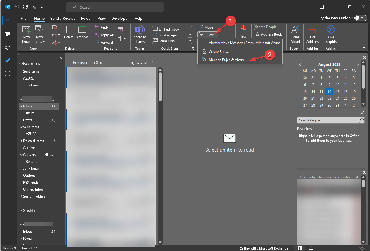
- Go to the Home tab, and click Rules.
- From the drop-down menu, select Manage Rules & Alerts.

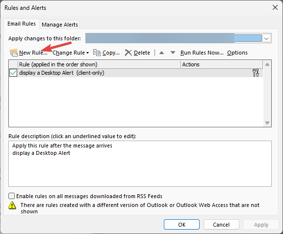
- Click New Rule from the Rules & Alert dialog box.

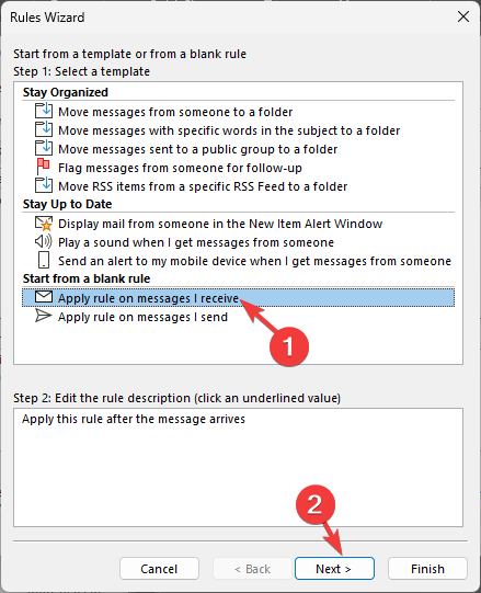
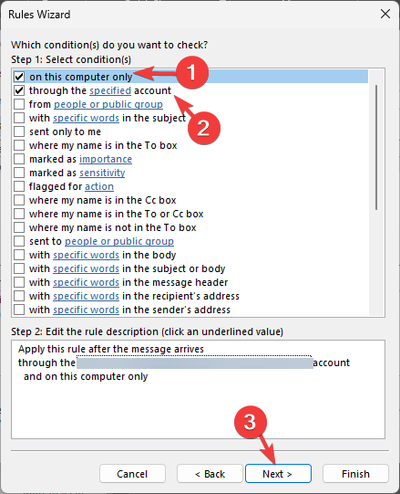
- On the Rules Wizard dialog box, place a checkmark to Apply rule on messages I receive and click Next.

- On the next page, place a checkmark next to through the specified account, and on this computer only, click Next.
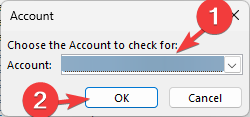
- Once it appears under Step 2, click the hyperlink on the specified and select an email address and click OK.

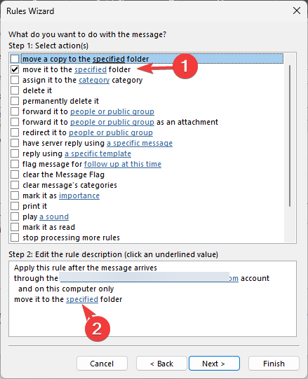
- Now, select move it to the specified folder, and once it appears in Step 2, click the hyperlink on the specified.
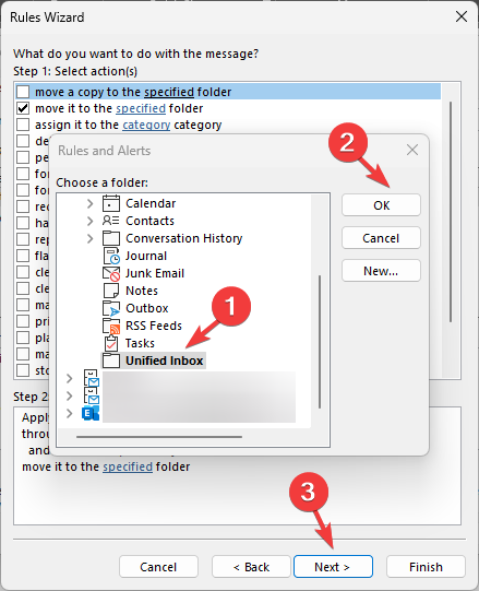
- Choose Unified Inbox from the pop-up window, and click OK; then, on the main window, click Next.
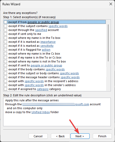
- You can add exceptions if you like or leave it as it is and hit Next.
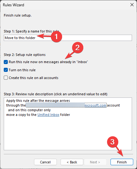
- On the next page, name the rule and place a checkmark next to Run this rule on messages already in Inbox, and check the Review rule description for errors field. Once you think everything is in place, click Finish.
- Click OK on the Rules and Alerts window to close it.
The rule will be applied to the selected email account in a couple of minutes. Follow Step 1 to 10 to add all the email accounts you want to get a unified view.
Once done, all the Inbox emails will sync and appear in your Unified Inbox folder; you get to see all the important emails in the folder even if the Inbox button is not working for you.
3. Use Visual Basic Code (Macros)
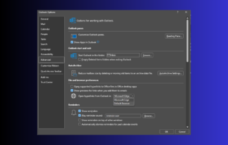
First, you will have to change the Macro settings:
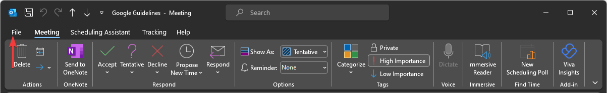
- Launch Outlook, and go to the File tab.

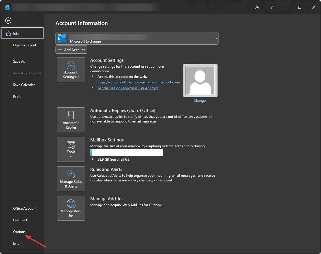
- Click Options to open the Outlook Options window.
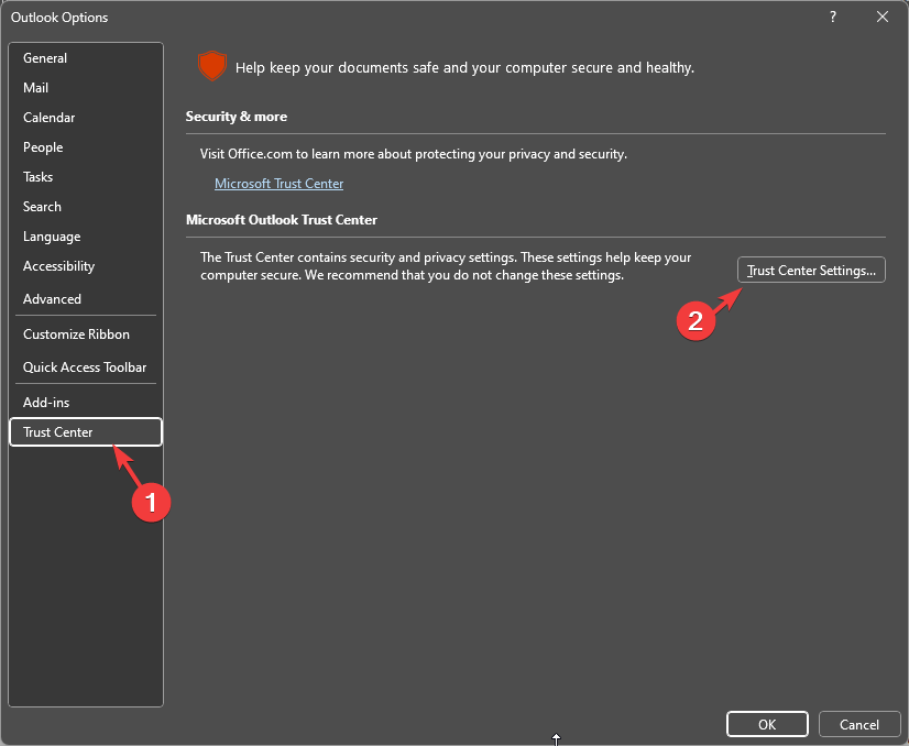
- Click Trust Center from the left panel, then click the Trust Center Settings button.

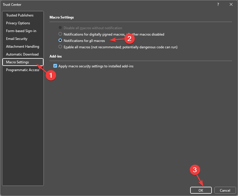
- Next, select Macro Settings, click the radio button next to Notifications for all macros, and click OK.
- Again click OK.
After changing the settings, you can use the VBA, here’s how you can do that:
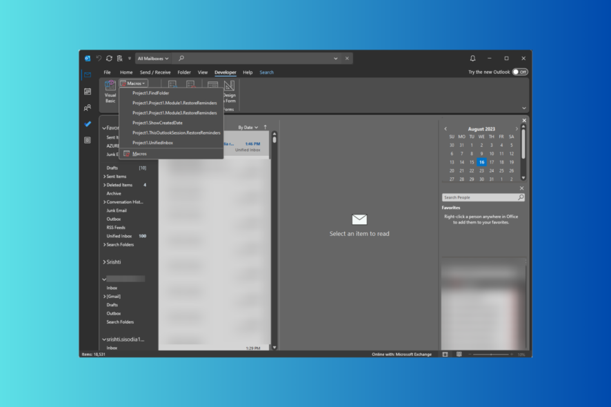
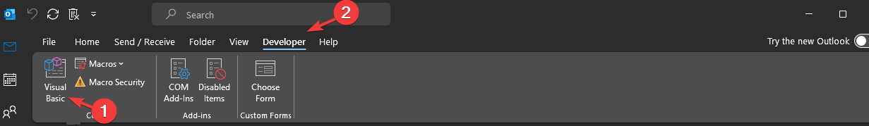
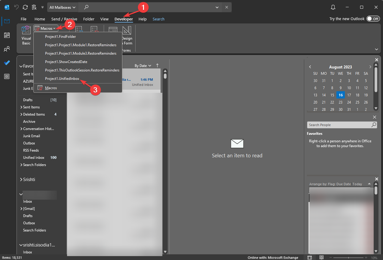
- On the Outlook main window, go to the Developer tab.

- Click the Visual Basic option to open Microsoft Visual Basic for Applications.
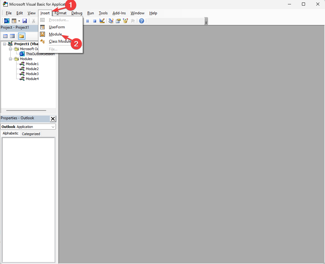
- Go to the Insert option, and select Module.

- Copy and paste the following code to the module and press Crtl + S to save it, then close the window.
Sub UnifiedInbox()

Dim xExplorer As Outlook.Explorer
Dim xSearch As String
On Error Resume Next
xSearch = "folderpath:Inbox"
Set xExplorer = Outlook.Application.ActiveExplorer
xExplorer.Search xSearch, olSearchScopeAllFolders
Set xApp = Nothing
End Sub
In the end, after changing the Macro settings and using VBA, you can run the code with the next steps:
- On the Outlook main window, go to the Developer tab.
- Select Macros, then from the drop-down, choose the one you saved.

- The action will run the query, and you will see all the inbox emails from multiple accounts displayed.
The results displayed would be similar to the ones that we saw in the Search bar method. You can use either of them.
However, with time the query from the search bar will drop off the list as you search for other things. Therefore, the macros method is useful as it saves the query, and you can run it whenever you want.
But keep in mind that using macros in Outlook can sometimes lead to small errors, such as Outlook is not updating inbox, but we have dedicated guide addressing that.
If you are facing any problems or have any questions while following the instructions, feel free to mention them in the comments section. We will be happy to help!