Chrome OS is a better tablet operating system than Windows 10 — Here’s why
![]() 7 min. read
7 min. read
![]() Published on
Published on
Share this article

Read our disclosure page to find out how can you help Windows Report sustain the editorial team Read more
There’s no doubt that Windows 10 has evolved a lot over the years. Many things like Action Center, the Start Menu, Task View, and a lot of other smaller everyday UI elements across the operating system have changed a lot since Windows 10 was first introduced in 2015.
One thing that hasn’t changed much, though, is tablet mode. Despite Microsoft pushing out its own flagship tablets like the Surface Go, Surface Book, and Surface Pro, tablet mode largely remains a mess in Windows 10.
Sure, last year’s October 2020 Update introduced some small tweaks to make tablet mode, but the traditional tablet mode experience largely remains a mix of leftovers from Windows 8.1, with custom touches for Windows 10.
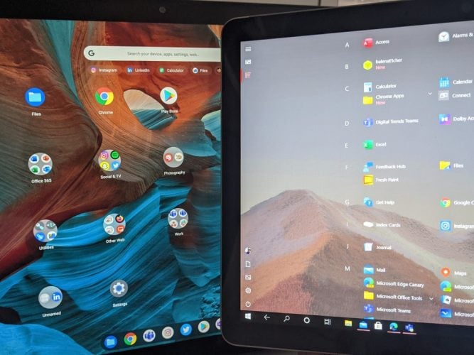
Enter Chrome OS. I recently purchased a Google Pixel Slate and coming from using a Surface Go 2 as my main device, I feel like Google has made a lot of advancements in tablet mode, making Chome OS the better tablet operating system when compared to Windows 10.
But could there also be lessons learned from Microsoft, and could Microsoft learn from Google? Let’s dive in to find out.
The main tablet mode user interface
Let me go first to where it all starts — entering tablet mode. In Windows 10, entering tablet mode has gone through some changes. Windows now recognizes the posture of your tablet and will automatically adjust the desktop user interface with a more touch-friendly layout. The taskbar gets more spaced out, the search bar collapses, and File Explorer adapts, too.
This change was actually introduced in the October 2020 Update, but you can still manually switch over to a more specially catered tablet mode (which I prefer) by configuring it in the Windows 10 settings. This traditional tablet mode has more of a full-screen experience and forces apps full screen rather than keep them windowed.
Lessons likely learned from Microsoft, Chrome OS handles this the same way. When a 2-in-1 Chromebook is flipped over, or a Chromebook tablet’s keyboard detached, the Chromebook will switch away from its traditional desktop-UI to a more compact experience, automatically. That is in the same way that Windows 10 used to automatically switch you to a specially catered full-screen tablet mode experience by default.
It’s here where the differences become apparent, though. It is also why I can see why Microsoft no longer forces users into that traditional tablet mode user interface. In Chrome OS, the tablet mode is clean and concise. You have a search box up top and a static list of icons for apps. This is reminiscent of what we’ve seen in Windows 10X, and I really do like the simplicity of it.
Basically, in Chrome OS tablet mode, you don’t have anything in your way. You get only what you want, and need. To me, this is important when you’re holding a tablet in your hand. It works just like a home screen on a phone — pick the app you want, and launch it. A full-screen Start Menu with Live Tiles doesn’t make sense in 2021.
Nobody cares to see information at a glance anymore, especially if they’re already planning to jump into that app by just tapping it, anyway. Again, look at why these Live Tiles are being phased out in Windows 10X as an example.
But the Windows 10 tablet mode mixes things up a bit too much for my liking. You get both your Live Tiles, as well as an option for a list of static apps. The list of static apps is the clearest, as my colleague pointed out to me, but it’s still a scrollable list and doesn’t have easily show or has a list of folders, as it is in Chrome OS. Lessons learned for Microsoft, as Windows 10X has a similar home screen.
But tablet mode goes just beyond a home screen, there’s also multitasking, switching apps, and using apps in a tableted mode. Let’s go there next.
Multitasking
Multitasking is the heart of any tablet mode. In Windows 10, when in tablet mode, you can drag down an app from the title bar to the right side of the screen to enter a split-screen view to multitask. This then lets you open any other open app on the left side of your screen.
As you know, you can close apps by dragging them down into the taskbar or clicking the “X” when triggering the split-screen view. You also can switch between open or pinned apps by tapping the back button in the taskbar, too, to go back. To resize Windows, meanwhile, you can just drag the slider between the screen.
There’s nothing wrong with that basic way of multitasking in Windows 10 tablet mode. It, in fact, works very well and is intuitive, which is why I think Google has done something the exact same thing in Chrome OS. But looking at Chrome OS, there are some added touches for multitasking in tablet mode that Windows 10 could use.
In Chrome OS, multitasking works as it does on Android. The system shelf ends up becoming “collapsed” so you can pull it up on it quickly as needed to switch between your pinned or open apps (reminiscent of the now-dead Windows 10X for dual-screen tablets.) A long swipe up and hold on the shelf, meanwhile, will bring you back to your home screen. You can then split-screen by dragging the app to the side of the screen you need it on, seeing suggestions for other open apps on the empty side.
Looking at this Chrome OS multitasking, there’s one thing I wish Microsoft could clean up in Windows — it involves the Taskbar. Chrome OS tablet mode collapses the system tray and presents you with floating icons for apps when you multitask. I wish Windows would do the same, with more gesture-based controls beyond what we already have. Everyone is already familiar with the swiping gestures from Android and iOS, so why not bring them to Windows, too?
The Taskbar in tablet mode is great, but it does feel cluttered at times (even when configured to be hidden.) Collapsing it down a bit, spacing the icons out on top of a floating Taskbar like Chrome OS would really help in terms of discoverability and switching apps. We’re getting previews of this in Windows 10X for single-screen devices, so there is hope ahead.
Using apps in tablet mode
The final thing on my list comes in relation to using apps in tablet mode. I touched on this when I talked about the lack of a tablet mode in Microsoft Edge, but after using Chrome OS, I think that Google is outdoing Microsoft in this area.
Why? When browsing the web in Edge in tablet mode, Edge retains all of its window controls. You still see controls to minimize, close the Edge window itself unless you manually enter full-screen mode. It feels a bit intrusive, as valuable space is being taken up for those controls. It is true that UWP apps, and select apps in Windows, do remove the window controls, but Edge does not, That’s a shame, as the majority of people spend their time web browsing.
Chrome OS steps things up and will “hide” the window controls in all apps, in the same way that Android does. It’s a really clean and concise experience. Especially when browsing through YouTube, or Twitter, which puts emphasis on the space for viewing media and other items.
Changes on the way
As I touched on throughout this post, there are indeed changes on the way to Windows 10. Rumor has it that sweeping visual changes are coming in the Sun Valley update to Windows, rejuvenating the look of the operating system. Even with Windows 10X, Microsoft is making bounds. The Taskbar, Action Center, and other areas of the operating system (which I didn’t touch on here when talking about Chrome OS) are all rumored to be getting big changes. We covered these in our video above, and it offers a breath of hope for Windows in the future.