Today, July 17, is World Emoji Day, an annual celebration of all emojis. On this occasion, Microsoft posted a blog post on the Microsoft Design blog yesterday to share some details about how it designs new Windows 10 emojis.
Emojis have definitely become a key communication element in 2019, and even “serious” apps such as Microsoft Teams and Slack allow users to use various emojis to react to messages. If you’ve been using the Windows 10 May 2019 Update, you may also have noticed that the emoji panel has been updated and is now more easily accessible with the Windows key + ; keyboard shortcut.
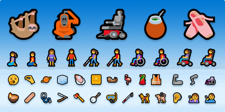
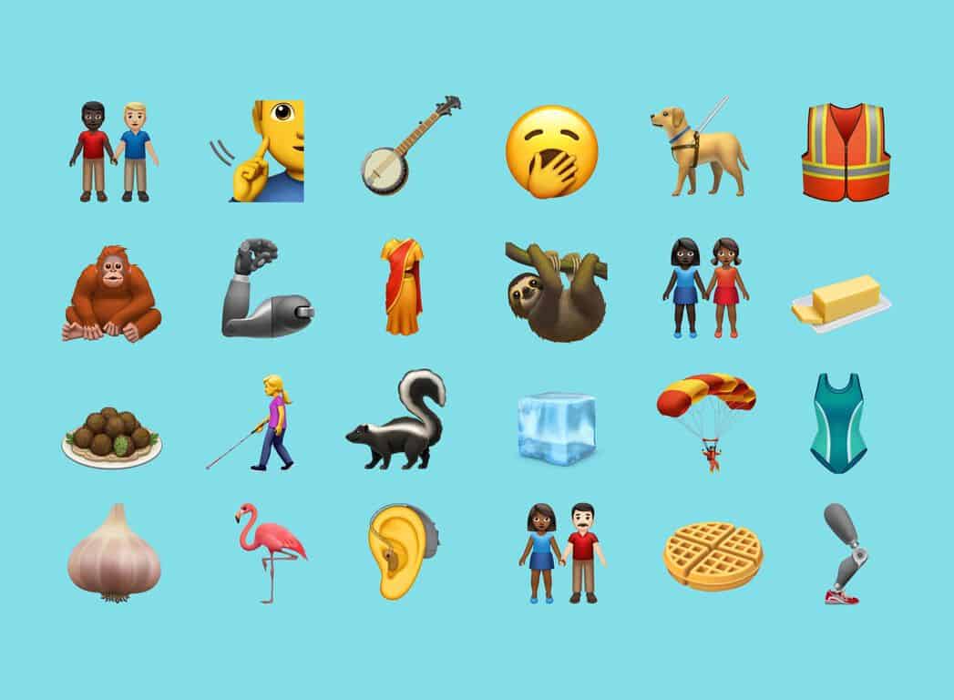
Since the launch of Windows 10, Microsoft has been following emoji updates from the Unicode Consortium pretty closely, and the May 2019 Update added all 230 Emoji 12.0 emojis including the new Yawning Face, eight new animals, new accessibility-orientated emojis, and more. It’s nice to see that Microsoft is keeping up with the latest emoji additions, but the style of Windows 10 emojis is starting to feel really out of place at a time where Microsoft is pushing Fluent Design everywhere including Windows 10, Office icons, as well as Microsoft apps on iOS and Android.
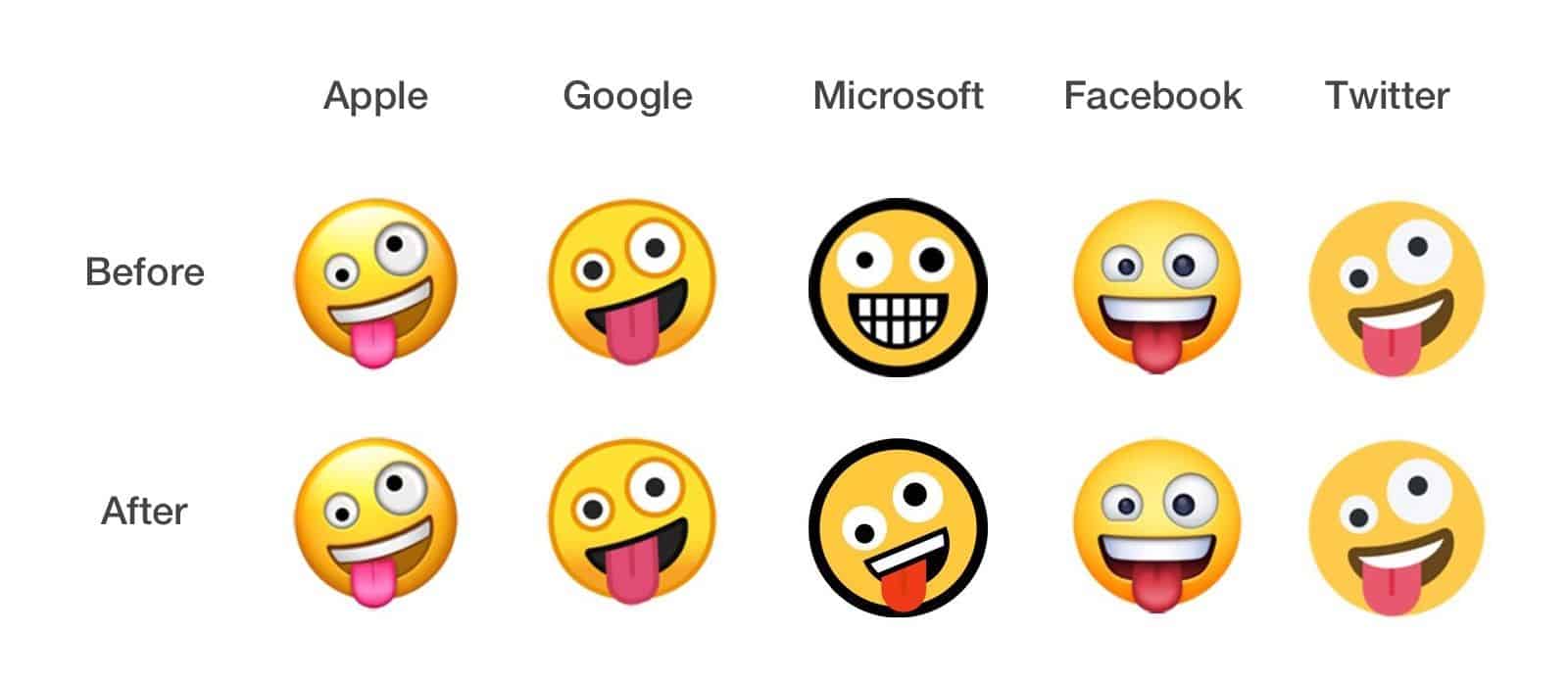
With Windows 10, Microsoft opted for a distinctive style for its emojis, which look quite different than what we had on Windows/ Windows Phone 8.x. Simply said, Windows 10 emojis look like nothing else on the market, with thick black borders, angular corners, and a very simplified color palette. The difference is pretty obvious when you look at this comparison for the Zany Face emoji, which Microsoft redesigned for the May 2019 Update
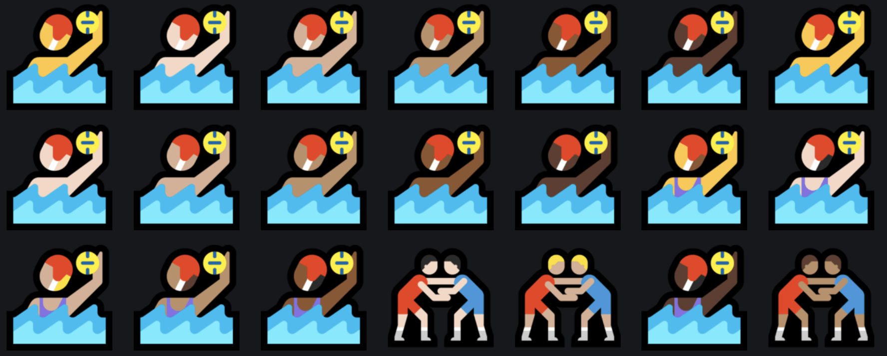
When you browse the full list of Windows 10 emojis, it’s pretty hard to find the same inspiration that gave us the redesigned Office icons. Many emojis just lack too many details, such as these Water Polo players who have no neck, no eyes, no nose, and actually no face at all. Many of Microsoft’s emojis just looks overly simplistic, and really out of place next to the much more detailed emojis from Apple, Google, and others.
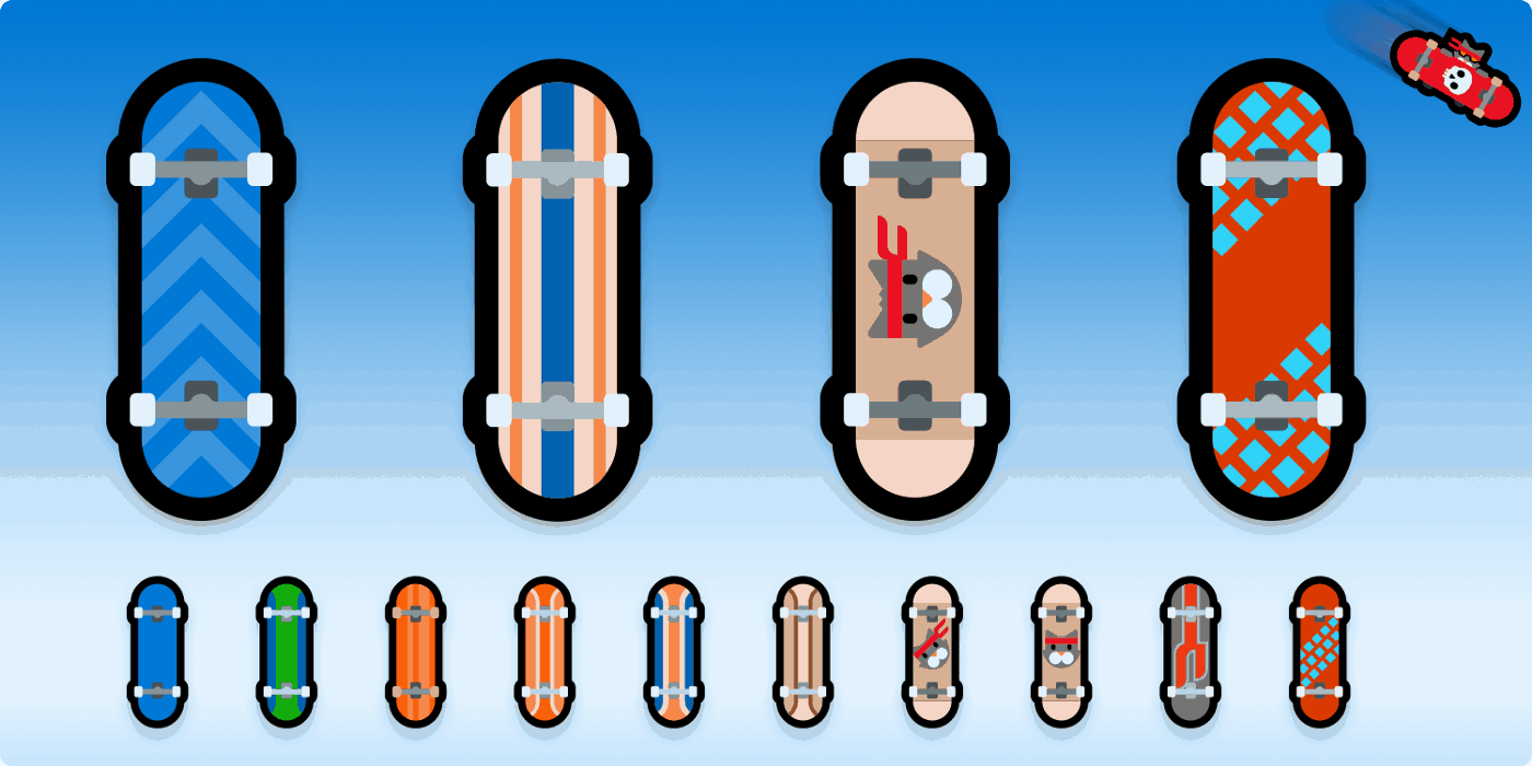
In the Microsoft Design blog, Microsoft explained that it can create up to 20 different versions of a new emojis before getting it right, as it was the case for the skateboard emoji. You can also notice that Microsoft can’t resist the urge to insert its Ninja cat mascot everywhere, and there are also several Ninja Cat emojis that are unique to Windows 10. I guess the majority of Windows 10 users would prefer a more “serious” way to look at emojis, though your mileage may vary.
Sorry Microsoft, but you can do better than that. The Windows 10 emojis looks really anachronic, and I’d say that the Skype emojis or even the old MSN emojis were much better than what we have now. As a matter of fact, it’s interesting to see that both Skype and Microsoft Teams continue to use the old Skype emojis instead of the Windows 10 ones, and that’s probably for the better.
Google received a lot of criticism for its “blob” emojis a couple of years ago, which looked as out of place as the Windows 10 emojis back in the day. Google switched to new circular emojis with Android Oreo two years ago, but Apple’s emojis still remain the gold standard. If you don’t believe me, you can take a look at Apple’s new emoji collection for 2019 below:
I’m not a designer myself, but I know that Microsoft has some very talented designers that could do some great work on a Windows 10 emojis revamp. I’m not sure how Fluent Design emojis should look like, but it’s certainly possible to design something that looks more consistent with other Fluent Design elements on Windows 10 and elsewhere. If you happen to be a designer, you’re welcome to share your own design ideas for Fluent Design emojis in the comments below!